ChatGPT has been my go-to design assistant for the last few months, and it’s completely changed how I build visual brands.
and honestly? It’s become a better ideation partner than most humans I’ve worked with. Including… me 😅
Because it’s freakishly good at noticing details.
→ A designer might see an 80s reference and maybe pull out the font and colour palette
→ While a GPT picks up on textures, layout structure, printing styles, and deep visual patterns beneath the surface.
If you use it right, you can bypass surface-level styling and jump right to visual language built to stick and actually stand out.
Start with a signature style, not just a vibe
Before we get to the prompts - let’s talk about the difference between a “polished brand” and a totally unforgettable one.
Because this isn’t about picking whatever style’s trending right now.
Its about having a unique visual signature - design assets that are instantly recognizable and unmistakably yours.
The kind of thing that makes people pause mid-scroll.
A little unexpected. A little out of place.
The glitch in the feed your audience’s brain can’t ignore.
Because in a scroll-happy online world, this is everything.
It’s what stops you from blending in with every other brand in your industry.
Some brands that totally nail this:
• Liquid Death – Metal aesthetic
• Stripe – Gradients
• Notion – Hand-drawn illustrations and characters
Each one has a visual signature - you know it when you see it.
That’s the goal.
And in the next section, I’ll show you exactly how to build yours using ChatGPT.
Step 1: Find your visual reference
This is where the fun starts.
I recommend starting with a single reference image - something that reflects a visual style you know you can own in your industry.
Tip: Look for something that clearly stands out from the usual look in your industry. If you’re not sure how to tell, I dropped my “contrast check” prompt at the end of this post.
Pinterest works. So does a Google image, a retro ad, book cover or even a screen grab from a video game you played growing up.
For example, I found this image of vintage VHS tapes on Pinterest and wanted to see if I could use it as the foundation for an entire brand identity.
Spoiler: the VHS tapes delivered 😍
Step 2: Turn your visual reference into a detailed style guide
Once you’ve picked your reference image, it’s time to feed it to ChatGPT and turn the vibe into a full brand system.
Here’s the prompt to do that:
Based on this reference image of [quick description of attached image] write a detailed brand visual style guide. Include:
1. Core Aesthetic
2. Colour Palette (primary and accent colours, with references to what they evoke)
3. Typography (headline + body options, tied to real-world usage)
4. Graphic Motifs (shapes, elements, layout symbols from the era)
5. Textures & Finishes (visual effects, print finishes, screen references)
6. Logo Treatment (how logos should appear, be placed, or textured)
7. Photography Style (lighting, backdrop, props, mood)8. Application Ideas (include four application ideas, labeled A–D. For each, include layout notes and how this brand style would be used in a real-world context:
A. LinkedIn Banner
– Mocked up with a profile photo on the left
– Show a slice of the LinkedIn UI (like the name + headline)
– Text and visuals should be designed on the **right-hand side**B. Podcast Video Setup
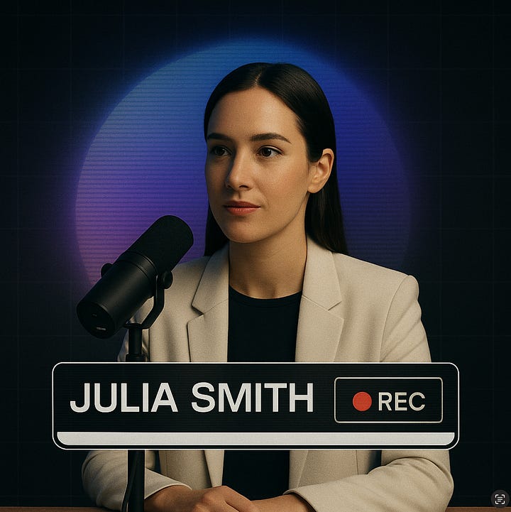
– Include a person in the frame with a microphone
– Include a stylized or branded **backdrop** and/or a branded **accent element** in the space
– Lighting should match the photography style in section 6C. Newsletter Banner
– Show it inside a realistic email layout mockup (header, text block, buttons, etc.)D. Website Hero Section
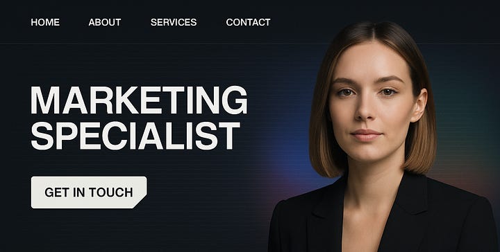
– Include a full-width hero with navigation bar, heading text, button, and a hero image
Here’s what ChatGPT gave me back:
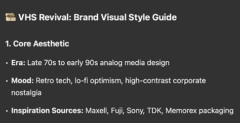
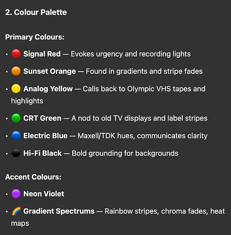
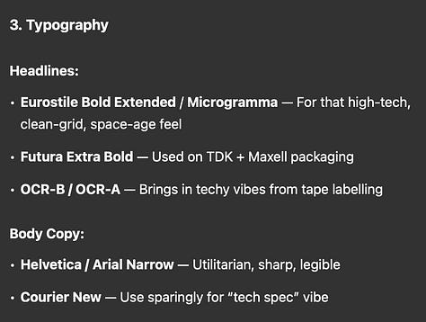
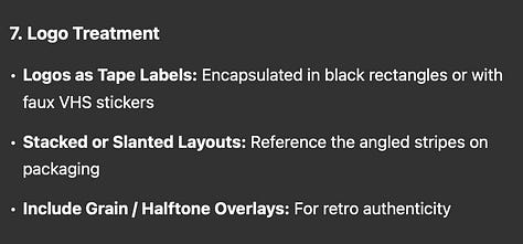
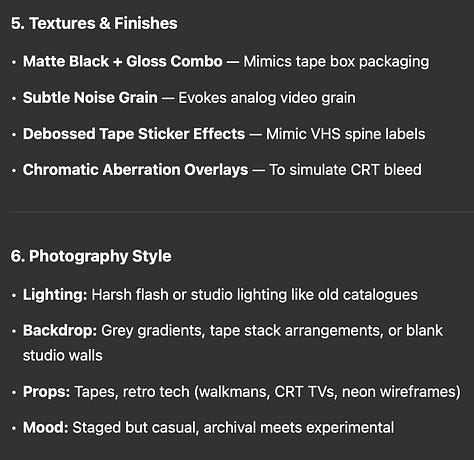
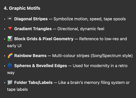
Step 3: Break it into visual pieces
From here, I ask ChatGPT to generate individual images for each section in the guide. This gives me really strong references for design decisions without having to imagine how it might look.
Here’s the prompt I used for the texture and finishes section:
Create an image version of this section: Textures & Finishes
• Matte Black + Gloss Combo — Mimics tape box packaging
• Subtle Noise Grain — Evokes analog video grain
• Debossed Tape Sticker Effects — Mimic VHS spine labels
• Chromatic Aberration Overlays — To simulate CRT bleed
And it gave me this:
I then did it for the rest of the sections:
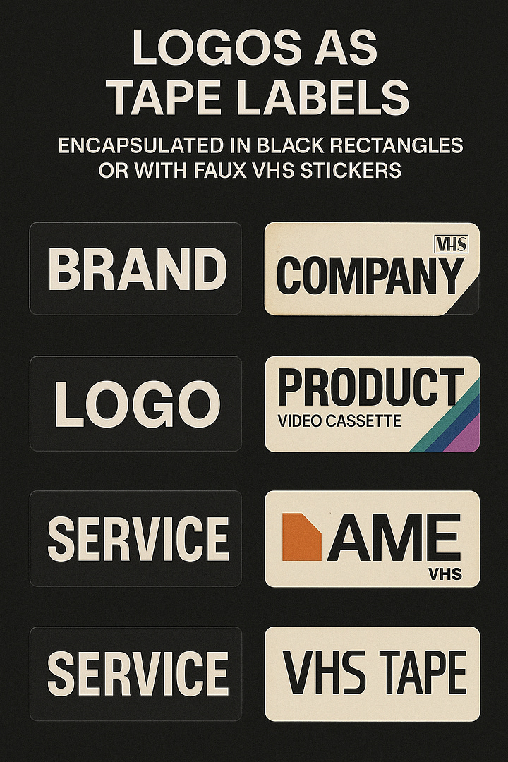
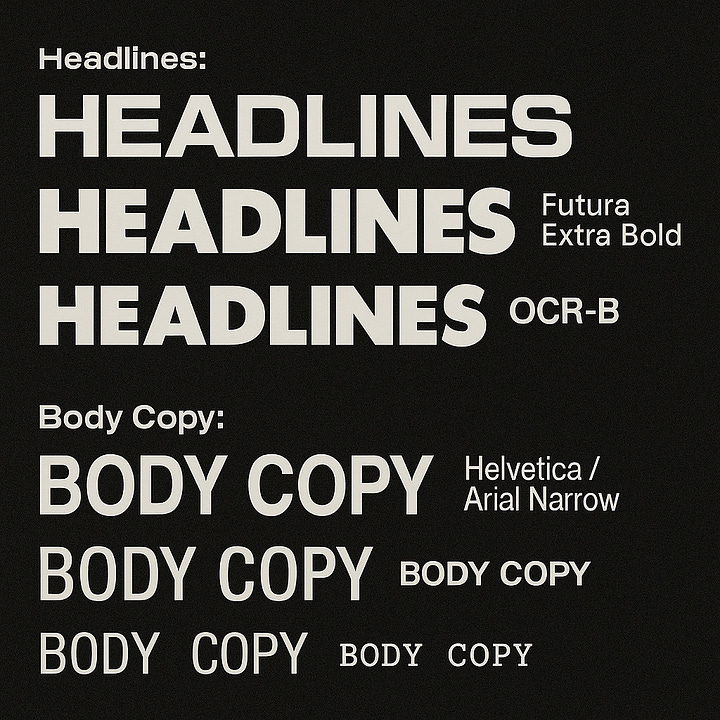
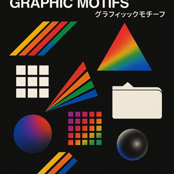
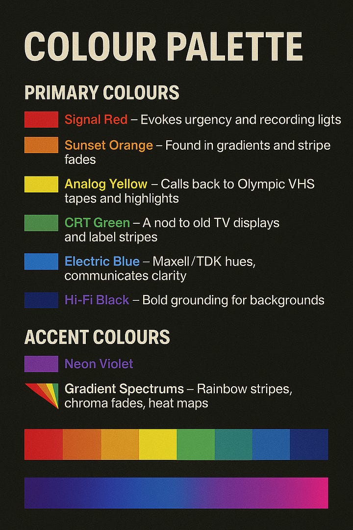
and a few applications:
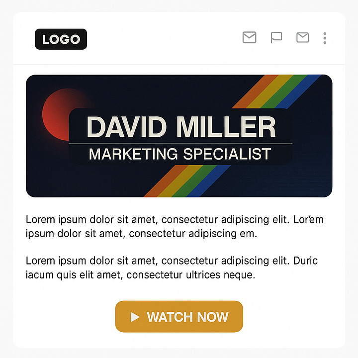
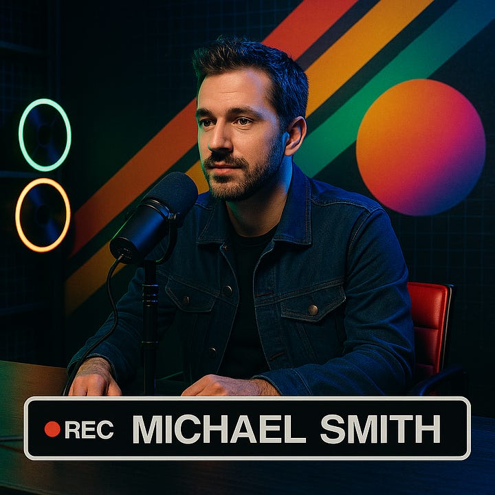
You can use this prompt:
Create an image version of this section: [Insert section number, name & content]
Tip: Instead of saying just “Section 4: Graphic Motifs.” I copy and paste the full list into the prompt because I find ChatGPT can miss things.
Step 5: Dial it back for balance
Okay, so far, we’ve pulled out some hardcore VHS-inspired pieces.
Grain. Label textures. Rainbow stripes. Bold retro typefaces.
And you might be thinking:
“Sarah… this is cool, but it’s a lot.”
Yah. It is.
There are cases where a full aesthetic takeover makes sense.
But for most, the goal is to borrow the character of an aesthetic…
Not get swallowed by it.
So here’s how I do that:
I pick a few of my favourite elements - like the scanline pattern, rainbow stripe and tape labels - and ask ChatGPT to refine the design. Make it cleaner. More elevated.
Here’s the new prompt:
Let's take this style and refine it.
Keep [colour/font/graphic/texture/photo style] but give it a cleaner, more minimal, high-end feel. Then write a detailed brand visual style guide and include:
1. Core Aesthetic
2. Colour Palette (primary and accent colours, with references to what they evoke)
3. Typography (headline + body options, tied to real-world usage)
4. Graphic Motifs (shapes, elements, layout symbols from the era)
5. Textures & Finishes (visual effects, print finishes, screen references)
6. Photography Style (lighting, backdrop, props, mood)
7. Logo Treatment (how logos should appear, be placed, or textured)
8. Application Ideas (include four application ideas, labeled A–D. For each, include layout notes and how this brand style would be used in a real-world context:A. LinkedIn Banner – Mocked up with a profile photo on the left – Show a slice of the LinkedIn UI (like the name + headline) – Text and visuals should be designed on the **right-hand side**
B. Podcast Video Setup – Include a person in the frame with a microphone – Include a stylized or branded **backdrop** and/or a branded **accent element** in the space– Lighting should match the photography style in section 6
C. Newsletter Banner– Show it inside a realistic email layout mockup (header, text block, buttons, etc.)
D. Website Hero Section– Include a full-width hero with navigation bar, heading text, button, and a hero image
Chatgpt gives me a whole new output with new design combinations to play with, and I start creating new images
Here’s a few samples of how that turned out:
Step 6: Remix with another aesthetic
Once you’ve got the base style locked in, you can start mixing in other influences to shape the design even more.
Just drop in another image. Tell ChatGPT what you like about it and ask it to blend that style into an existing image.
For me, I found a book cover with a cool pattern and asked it to pull that into the mix.
Here’s what I got back:
Try something like:
Take this [describe new reference image] and blend it with [describe existing image].
Pull in [specific detail you like].
Keep [specific elements from the original].
Wrap Up
And that’s about as far as I’d take it inside ChatGPT.
From here, I’d jump into Canva or Figma and use the images I generated as a reference - tweaking, refining, and shaping everything into a full brand identity.
It’s not the final product but now you’ve got real stuff to build on.
✤
If you’re sitting there thinking,
“Okay cool, but… I still have no idea what my visual signature should even be,”
or you’re feeling overwhelmed about turning all this into a full brand…
I’ve got you covered:
Brand You: The Visual Sales Funnel System is launching soon.
Oh, and as promised, here’s the contrast check prompt to make sure you’re not accidentally blending into your industry:
Identify the dominant visual trends in the [insert your industry] space. Break them down into three categories:
Design Elements – Recurring visual choices like fonts, colours, layouts, and illustration styles.
Brand Personality Cues – The moods, vibes, and emotional signals brands in this space lean into.
Aesthetic Tropes – Overused stylistic patterns, themes, or visual storytelling techniques that make brands in this space feel predictable.
and then based on those list 3 visual directions that would subvert those usual trends.
PS. If you end up playing with this, send me your stuff—I love geeking out over this kind of thing.
P.P.S. Thinking of doing a video where I take this into Canva and start building out the whole brand. Let me know if you’d watch that!


I’d definitely watch that!
Yes I agree with Kat! I definitely would. This was great. A lot of LinkedIn biz creators (small accounts) would watch to learn