
The weird design test I do before every client project
(It's how I can tell if my client has good brand strategy)

Wanted to share a cool pattern i’ve noticed in my work lately…
When the brand strategy or message is strong, I can see it….like, see it, see it.
My brain just starts firing off 100 ways to show it through visuals.
But when the message is muddy… it feels like grasping at straws and the design ideas can end up feeling generic.
Using visuals as a sort of “litmus test” for clarity has actually helped sharpen my clients’ brand strategies a lot.
If we can’t visualize it, it’s usually not strong enough yet….so we dig deeper.
We hunt for that one sharp idea, the line or perspective that gives the brand something solid to stand on.
Why your brain loves visual clarity….
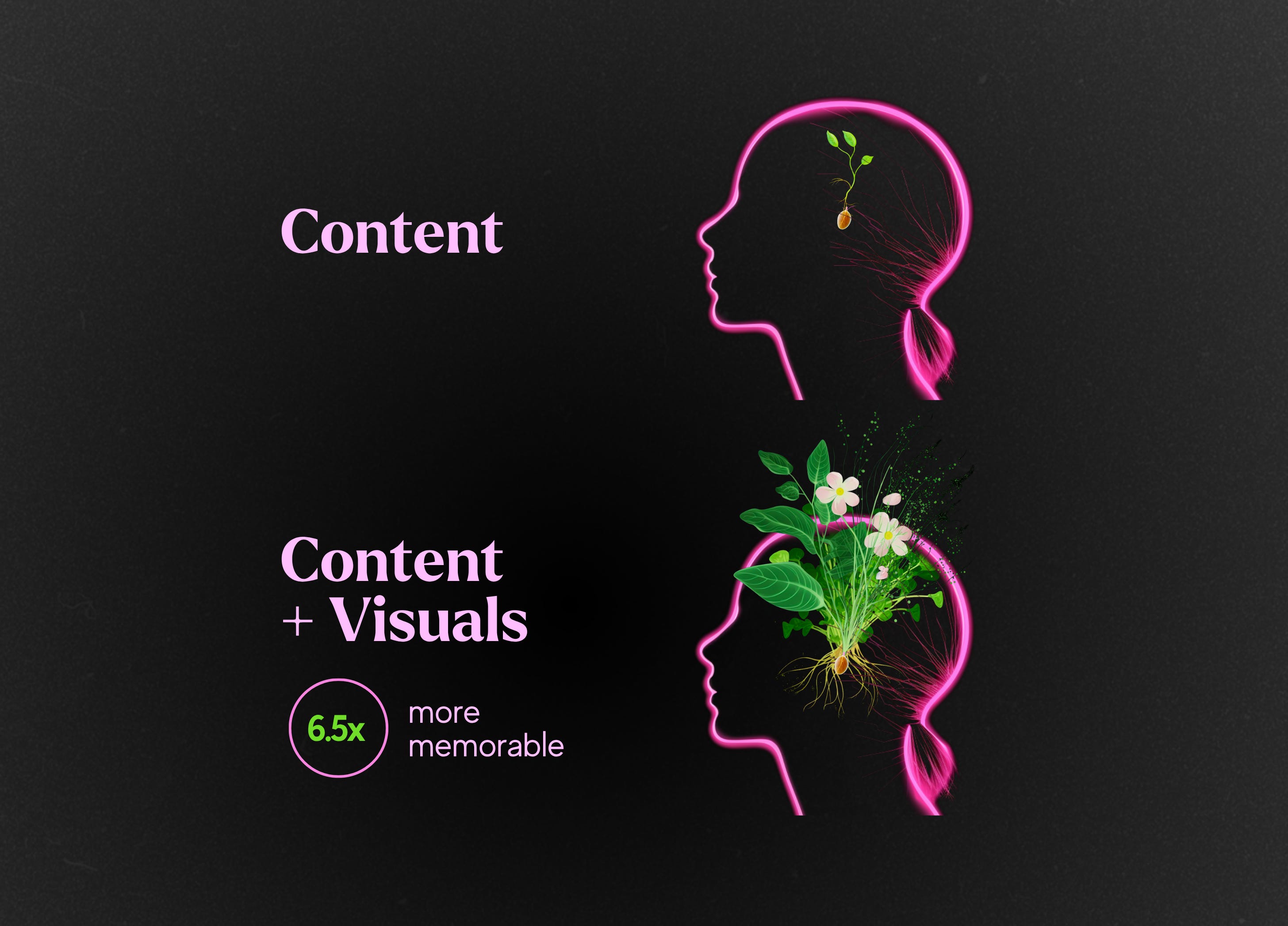
When your visuals start doing the talking, the message clicks faster.
Its because our brains remember visuals better than words (that’s the picture-superiority effect), your brand’s message becomes stickier when you show it rather than just say it.
Here’s how the strongest brands use it:
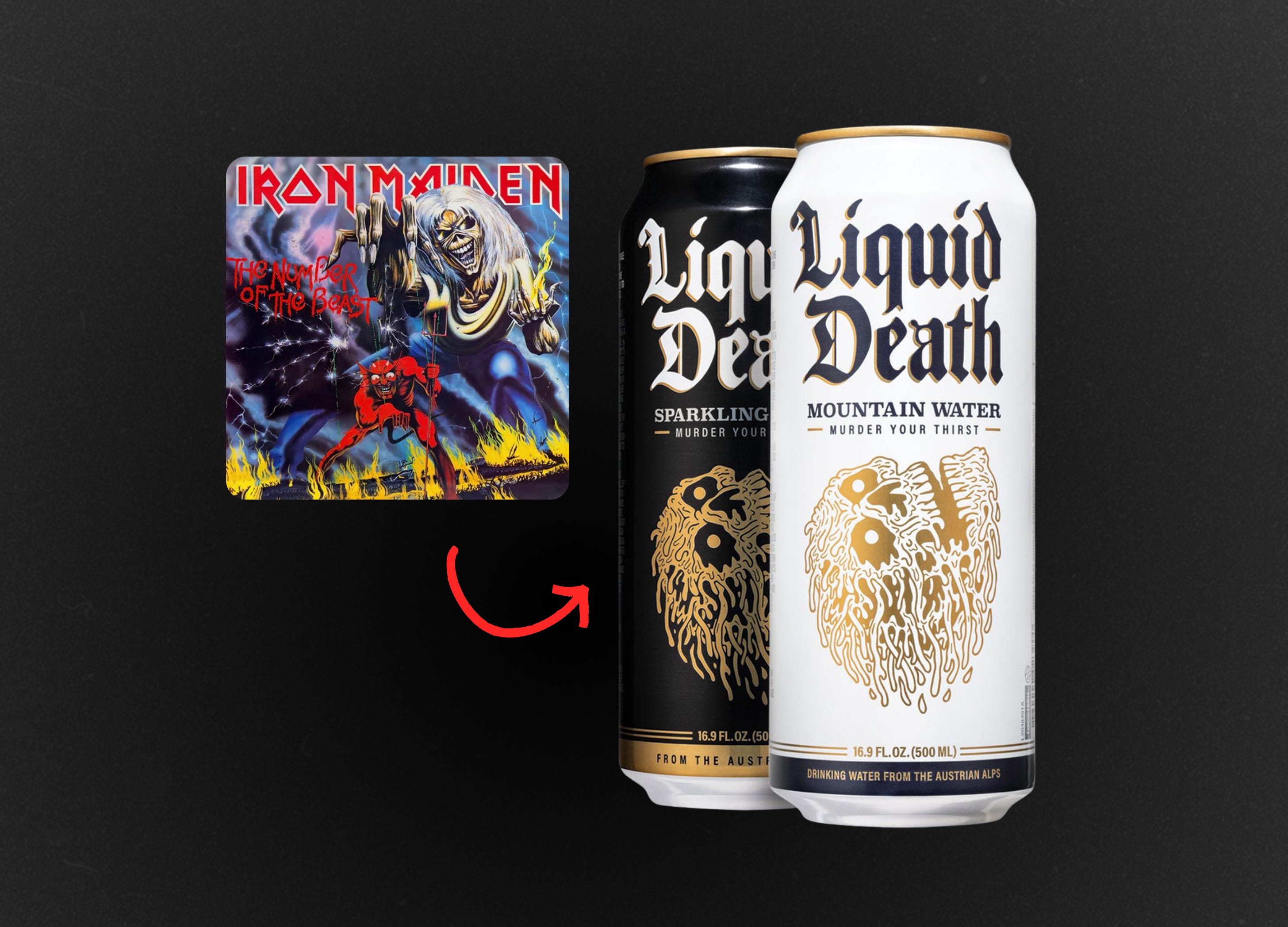
Liquid Death
They didn’t just try to make water look cool.
They turned “murder your thirst” into an entire metal-inspired identity.
The brand looks exactly how it sounds.
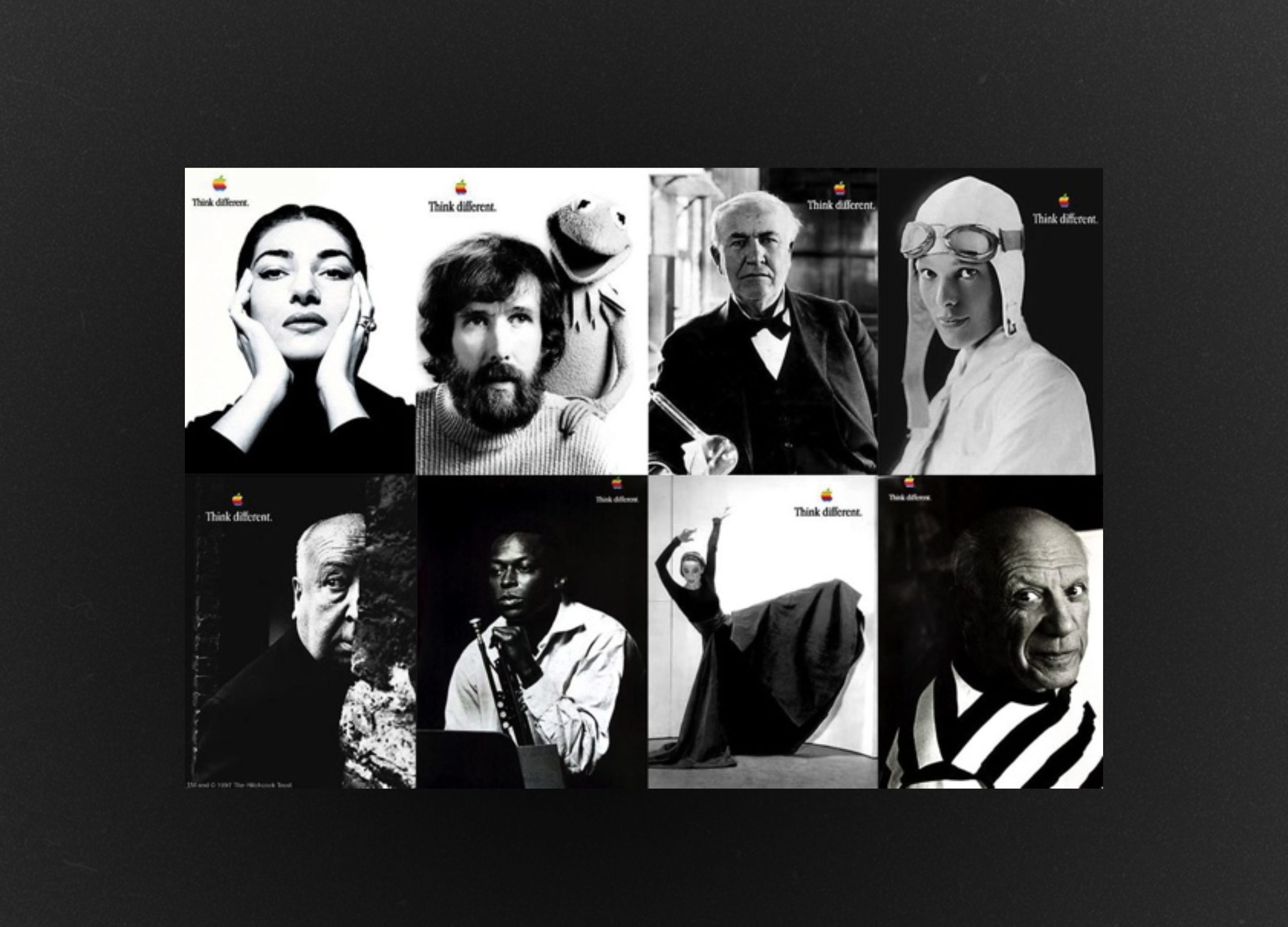
Apple
They didn’t just say “Think Different”
They showed it….pairing those words with iconic portraits of people who actually did think different.
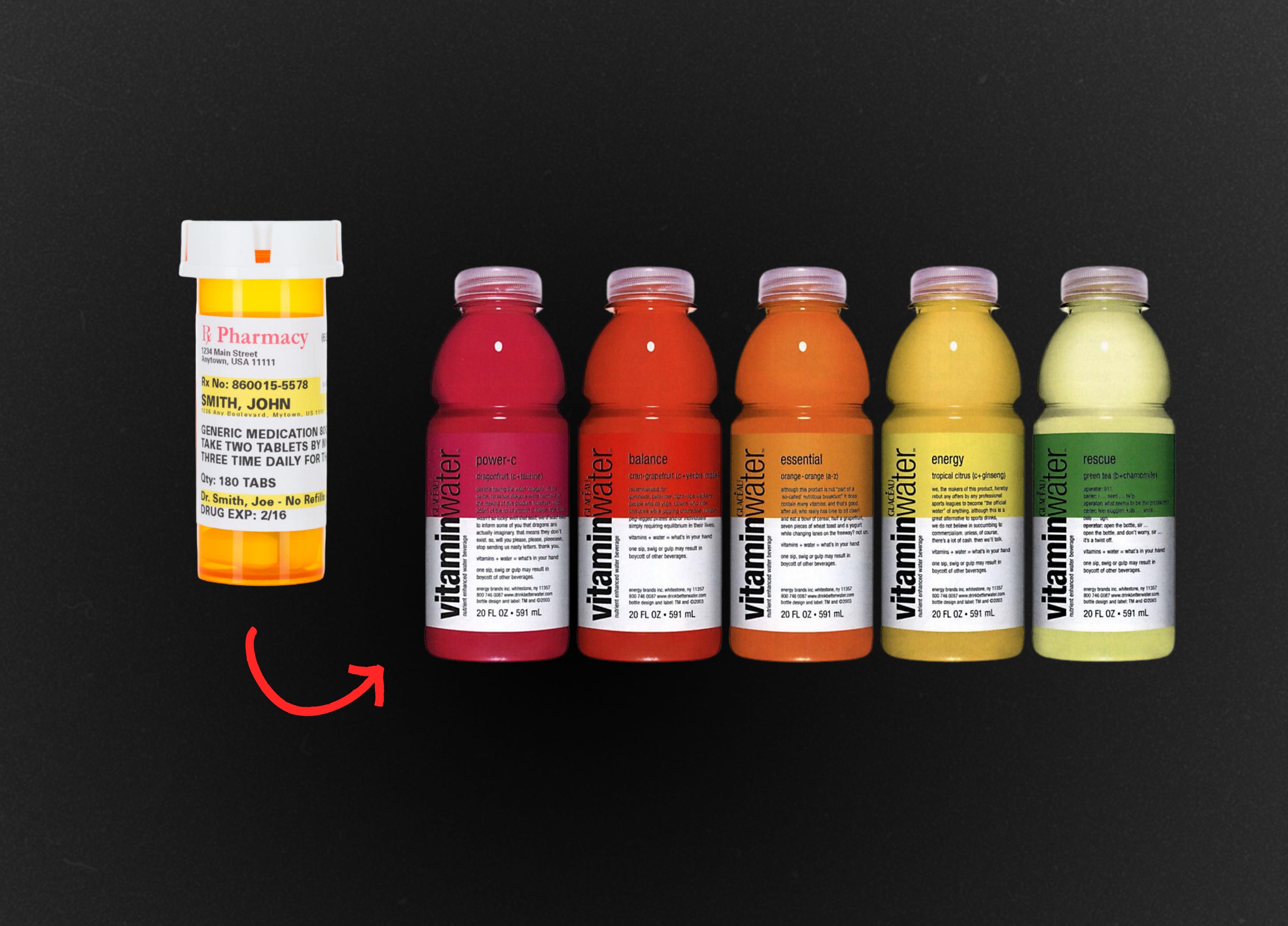
Vitamin Water
They didn’t just claim to be more potent than other drinks.
they showed potency by borrowing from pharma design…making each bottle looked prescription-strength.
They don’t just say what they stand for - they show it.
Examples from my own clients
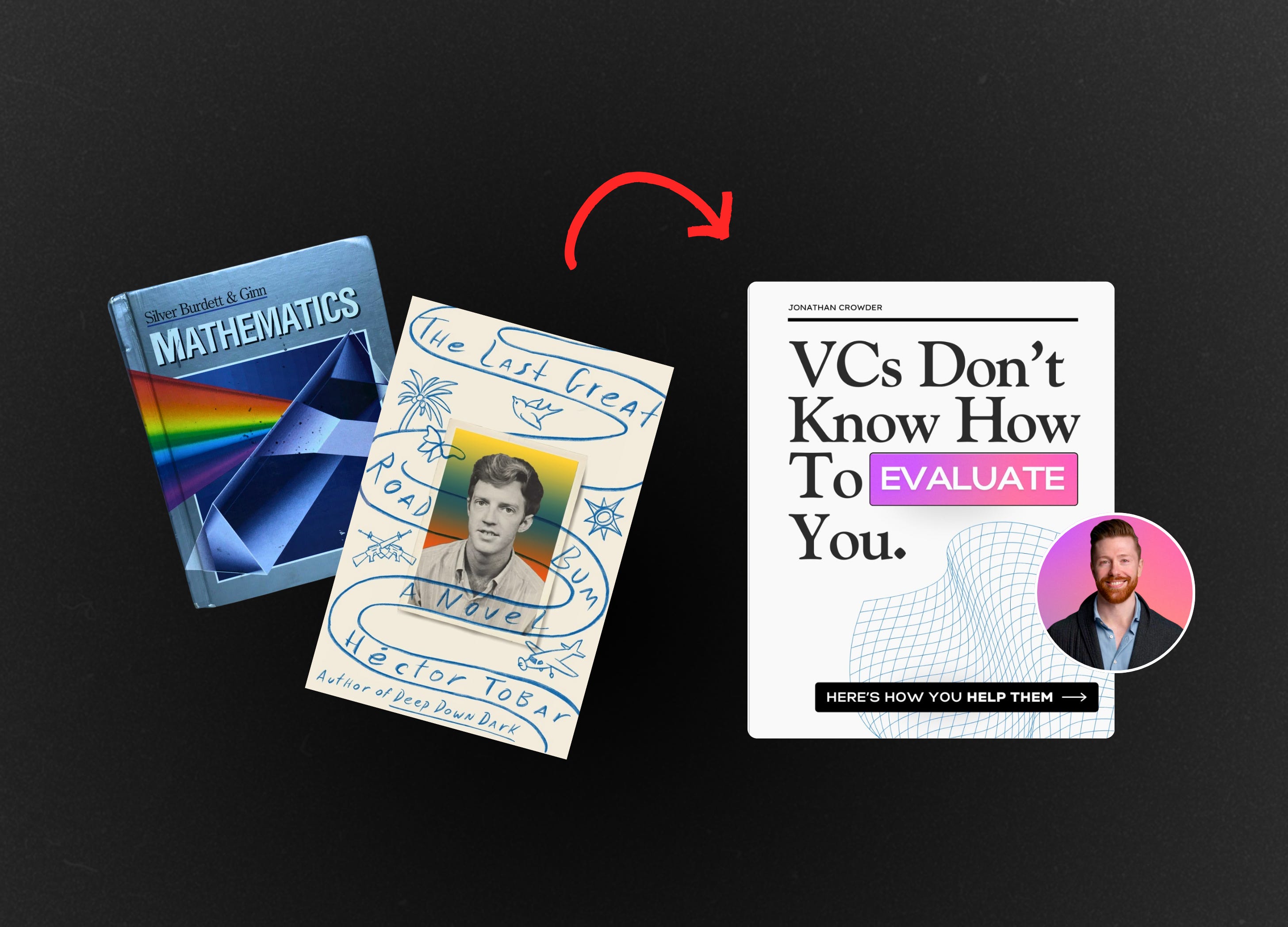
Jonathan Crowder
In our kickoff we uncovered that Jonathan’s unique POV was that Fundraising is a Science, not art
So we built a brand inspired by scientific textbooks to show that visually.
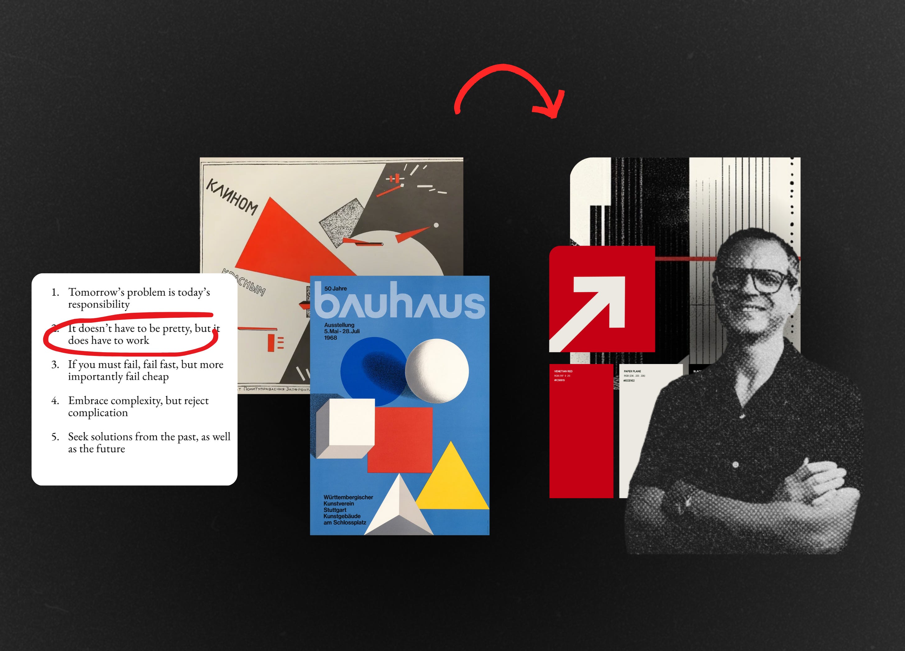
David Tyler - Outlier
As we worked together, we kept coming back to a line from David’s manifesto:
“it doesn’t have to be pretty, it just has to work.”
That one sentence totally lit up my brain… instantly reminded me of Bauhaus and constructivist design, both rooted in function over form.
Katelyn Bourgoin - Why We Buy
As Why We Buy continued to grow, we wanted to weave more of the psychology theme into the visuals.
That’s when Brian the Brain was added to the brand.

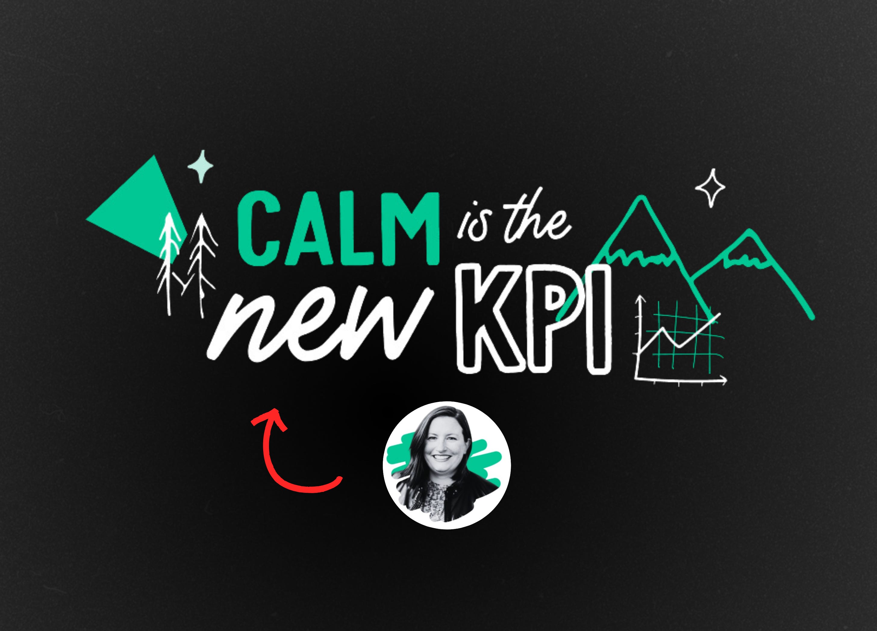
Susan Bole - Beyond Margins
Susan came in with a killer line: “Calm is the new KPI.”
We decided to make that idea visible…using nature-inspired elements and hand-drawn details.
The organic aesthetic stood in stark contrast to the sterile, corporate visuals typical of finance.
So, does your brand actually translate visually?
I’ve got an AI prompt that will help you test the strength of your …and i’ll walk you through it in this video:
P.S. Just got back from a spontaneous little trip following a random food blogger around London + Amsterdam with my husband
P.P.S. I’m officially booking my final few projects before I go on mat leave in February.
If you’ve been lurking 👀 and thinking about it….this is your sign.
So good, Sarah! Would love to see that prompt too!
Totally badass and spot on approach. Im not a visual designer in any sense, I do Category Design, and so often a company describes what differentiates them and I look at the brand and the visual connection is not there. It’s a hindrance to growth. Would love to tty out your prompt.