
When Distinctive Looks Disgusting
Ganola's Rebrand: Genius or Disaster? 🤢

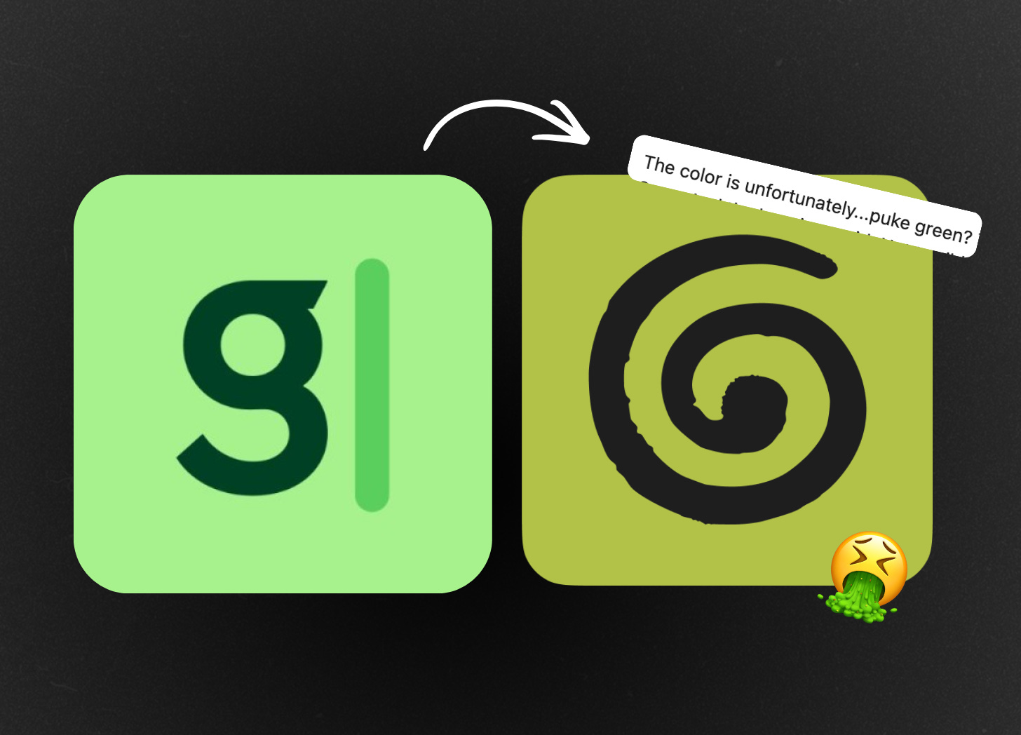
So granola the ai notetaker just rebranded.
and the internet is nooot happy about it.
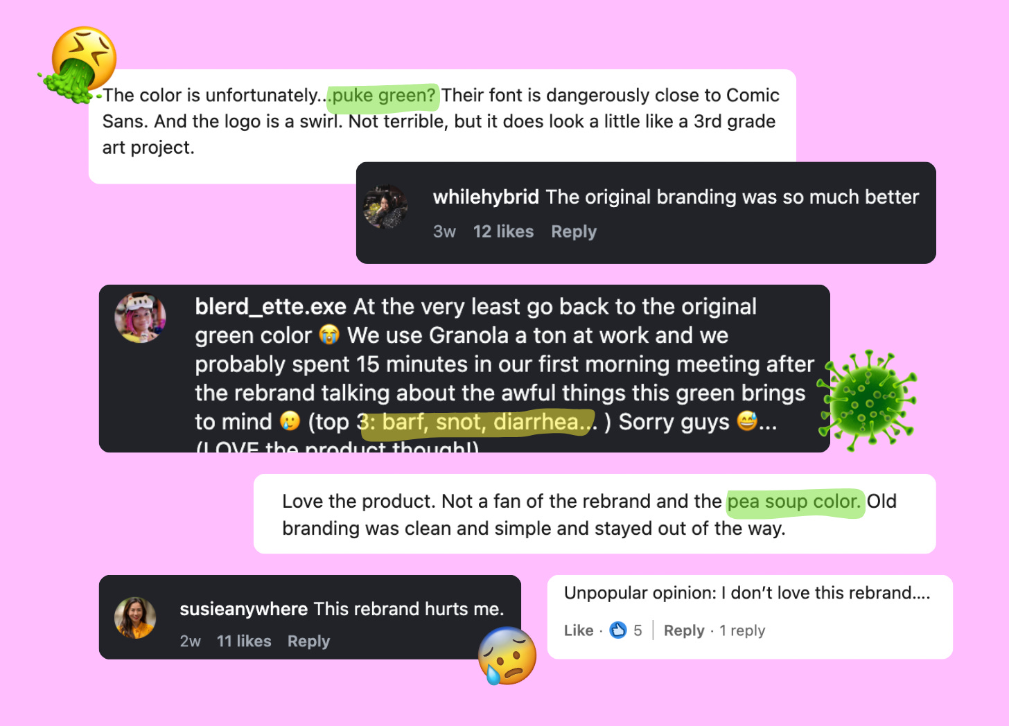
i’ve seen comments calling the new colour “puke green” “barf” “baby poop”:
and NGL… i kinda get it.
I did some digging into the research on human colour preferences and there’s actual biology behind that reaction:
The Evolutionary Ick Factor
When researchers ran large-scale studies asking people to rank colours from most to least preferred, that muddy greenish-yellow shade consistently lands near the bottom. not slightly disliked. aggressively disliked.
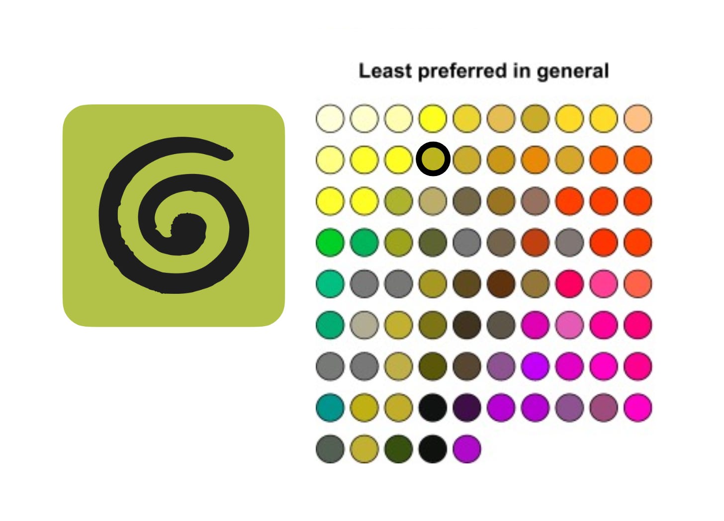
the dominant theory here is called ecological valence theory, which is just a nerdy way of saying: we like colours tied to good things in nature, and we dislike colours tied to bad ones.
And that particular shade of bile green? Evolutionary speaking, it's associated with rot, mold, decay, and things our monkey brains learned a long time ago to stay far away from. So the visceral reaction makes total sense.
And okay, confession time: i've been pretty vocal about how most colour psychology in branding is oversimplified at best. The whole “blue = trust” thing is total BS.
but this shade? I feel like ive eating my words here bc this one goes against our very evolution.
Rewiring the Association
Now, here’s where it gets interesting, because the story doesn’t end there.
Just because a colour carries negative associations doesn’t mean those associations are permanent. Brands have actually rewritten these kinds of connections before, and one of the coolest examples is Hermès.
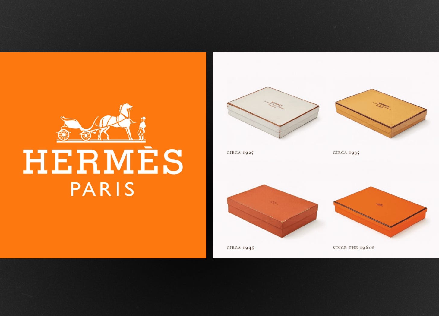
Hermès didn’t start as the orange box brand. before WWII, they used the same neutral creams and beiges every other luxury house did. then wartime shortages hit, and they were forced to use this bright orange packaging bc it was all that was available.
At the time it felt loud and cheap, which is obviously not the vibe you want for one of the world's most expensive handbag brands.
But instead of switching back after the war, they just… doubled down on it.
They stayed consistent, kept pairing that orange with everything that made them feel high-end and aspirational, and over time they literally rewired the association in their audience's brain.
Now when you see that Hermès orange, you don't think loud and cheap, you think luxury.
They own that colour in a way that no other brand can touch, and every time someone spots it in the wild, their brain automatically routes to Hermès.
Ugly… or Strategic?
So… the real question isn’t “is granola’s green ugly?”
it’s “can they sit in the discomfort long enough to make it theirs?”
because every other AI app right now looks exactly the same (purple gradient. soft glow. clean sans)
Granola's bile green is the total opposite of that. It's so specific, so weird, so not what anyone expects from a software product that if they stay consistent with it, there's a real chance that shade of green just becomes Granola in people's brains.
this is the Von Restorff effect. when everything looks the same, the anomaly sticks. your brain remembers the outlier. the glitch. the weird one in the room.
being the visual disruption is it’s own power play for a brand.
So, what are their options?
they stay the course, fully commit, and try to build colour ownership over time.
or they soften it, keep the green but ground it in black and white, make it feel more intentional and less… swamp.
Personally? i’m fascinated. this is a live case study in distinctiveness vs likability.
Whatever they do, i'm really curious to see where it goes. It's a live experiment in whether a brand can consciously choose to be the weird thing in the room and actually win because of it, and i'll definitely be watching!
PS. if you noticed this newsletter went a little quiet… that’s because I welcomed my new baby on February 21st!

(and yes, he was delivered in the car 😅… here’s the whole story).
I’m on maternity leave not taking any clients for the next few months, but the plan is to keep up bi-weekly posts here while the baby naps 🤞